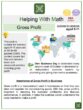
Introduction
Graphs might be difficult to understand right away since various pieces of information must be read. Since adults and children experience this challenge, pictographs can benefit everyone. Icons and images are used to represent data in charts and graphs, known as pictographs.
A pictograph employs visual symbols to represent numerical data. Pictographs should be used cautiously to avoid erroneous or purposefully misleading data.
In this article, we will define pictographs, look at a few examples, learn when and how to use them, and discuss their benefits and disadvantages.
Pictographs
Definition
Pictographs, often known as pictograms, use symbols to communicate facts graphically. Each icon represents a specific number of units and is arranged in a single line or grid. One of the easiest ways to display data is through pictographs.
We can represent the frequency of data using relevant symbols or images in a pictograph.
Mathematicians regularly utilize pictographs to demonstrate ideas like information processing and lay the groundwork for visual data interpretation.
Elements of Pictographs

A pictograph cannot be complete without the following elements.
(1) Title
The title of the graph is often displayed at the top. The title makes it obvious what the graph is about.
(2) Images or Symbols
The symbols are used to indicate a given amount of data.
(3) Classifications or Labels
The graph’s classifications specify the precise type of data that is there.
(4) Key or Legend
A key indicates how much each image stands for.
Let’s examine the pictograph below and list its elements.
The number of trees planted in a week is displayed in the pictograph below.
| Day | Trees Planted |
| Monday |  |
| Tuesday | |
| Wednesday | |
| Thursday | |
| Friday | |
| Saturday | |
| Sunday | |
The title “Trees Planted” immediately conveys the idea that the pictograph indicates the number of trees planted. The “Day” categories let us know which days make up a week; they are listed from Monday through Sunday.
The pictograph’s symbol ( ![]() ) is used to represent a certain quantity of trees. According to the key, each tree is equivalent to 10 trees. Therefore, multiply the number of trees each day by 10 to get the total number of trees planted each day.
) is used to represent a certain quantity of trees. According to the key, each tree is equivalent to 10 trees. Therefore, multiply the number of trees each day by 10 to get the total number of trees planted each day.
We need some simple math to determine how many trees were sold each day because we already know that 1 tree ( ![]() ) equals 10 trees planted. Therefore, we have
) equals 10 trees planted. Therefore, we have
Monday: 3× 10 = 30 trees planted
Tuesday: 2 × 10 = 20 trees planted
Wednesday: 4 × 10 = 40 trees planted
Thursday: 4 × 10 = 40 trees planted
Friday: 6 × 10 = 60 trees planted
Saturday: 7 × 10 = 70 trees planted
Sunday: 8 × 10 = 80 trees planted
The pictograph could answer more questions besides just how many trees are planted daily. Through analysis, we can also learn how many trees were planted overall in a particular week, which day has the highest or least planted trees, etc.
Points To Remember When Creating a Pictograph
The following are some key considerations when creating a pictograph:
Collect the data
The first stage of constructing a pictograph is getting the necessary information we want to display. After the information has been gathered, put it in a table or list. Additionally, the data categories must be accurately defined.
Selecting the appropriate symbols
Decide on symbols or images as the data’s visual representations. The provided data must be represented using the most appropriate symbols or visuals. Symbols can be used to represent fractions if the frequency is not a whole number.
Assign a key
When showing data using images, use a key to specify each image’s value because if the frequency of the data is too high, one image cannot sufficiently represent it. As a result, the “key” number value is used, which also needs to be written beside the pictograph.
Use columns
Use columns to denote the category and data while creating a pictograph. Make a pictograph using symbols or graphics to show the frequency of the data.
Examine the data
Check that the categories or labeling and the images accurately reflect the data after the pictograph has been created.
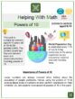
Think about the more colorful garden flowers, such as red, yellow, blue, orange, pink, and white. Let us make a pictograph that shows how many flowers are in the garden.
Collect the data
The table below displays the data that was gathered. The count and color of the flowers are presented.
| Red Flowers | Yellow Flowers | Blue Flowers | Orange Flowers | Pink Flowers | White Flowers |
| 15 | 12 | 6 | 3 | 18 | 9 |
Selecting the appropriate symbols
The symbol ( ![]() ) will be used as a visual representation of the flowers in the garden. Choosing a picture for the symbol is crucial, and it should be pertinent to the information gathered.
) will be used as a visual representation of the flowers in the garden. Choosing a picture for the symbol is crucial, and it should be pertinent to the information gathered.
Assign a key
We will represent each symbol as equivalent to 3 flowers since the given data is a multiple of 3. We, therefore, have![]() = 5 flowers. Make sure that the total number of your images matches the number of flowers.
= 5 flowers. Make sure that the total number of your images matches the number of flowers.
Use columns
We will use two columns to construct the pictograph for the data collected. The first column labels are the colors of the flowers in the garden. The second column indicates the number of flowers.
| Colors | Number of Flowers |
| Red | |
| Yellow | |
| Blue | |
| Orange | |
| Pink | |
| White | |
Examine the data
The total number of flowers in each category must be appropriately represented in each row of the data collected. There should be five flowers in the pictograph, as there are 15 actual red flowers. There should be four flowers will be used to represent the yellow flowers, two for the blue, one for the orange, six for the orange, and three for the white.
| Colors | Number of Flowers |
| Red | |
| Yellow | |
| Blue | |
| Orange | |
| Pink | |
| White | |
The pictograph of the number of flowers on the farm has been created successfully.
Let us demonstrate the accuracy of the numbers using addition:
| Red | 3 + 3 + 3 + 3 + 3 = 15 |
| Yellow | 3 + 3 + 3 + 3 = 12 |
| Blue | 3 + 3 = 6 |
| Orange | 3 |
| Pink | 3 + 3 + 3 + 3 + 3 + 3 = 18 |
| White | 3 + 3 + 3 = 9 |
Why do People use Pictographs?
There are many uses for pictographs, some of which are listed below.
(1) Whether you want to illustrate a fraction or percentage or highlight the size of an important statistic, pictographs can give simple facts and visual importance.
(2) Pictographs can be quite helpful for presenting data visually in infographics, reports, presentations, and even resumes. Pictographs are also striking and extremely clean, making them more aesthetically pleasing.
(3) A pictograph can make simple information more visually appealing, memorable, or interesting. Since charts are the easiest to read of all data displays, readers can quickly understand what a graph is trying to convey.
(4) Pictographs are a great way to teach kids about data processing because they are visual and often easy to understand and analyze. Kids can count the items to find out how many of each item there are.
(5) Children and adults can quickly draw essential conclusions from the facts presented using a pictograph key.
(6) Because they are made from a group of symbols, pictographs are particularly helpful when you require a striking visual but lack access to a graphic designer.
(7) Pictographs are utilized similarly outside the classroom to help readers relate a bar chart to the idea it illustrates.
(8) When a large number is involved, people can comprehend numbers more clearly.
(9) Data from surveys are evaluated, participants are evaluated, and goals are progressed using pictographs.
(10) Pictographs can be used in advertisements to organize facts and show the prevailing opinion on a particular topic. Ads may include pictographs to highlight a product’s level of appeal or a consumer issue it might address.
Pictographs in Statistics
In statistics, pictographs are charts that use pictures and icons that are appropriate for the data to represent the data. Frequently, a pictograph includes a key that explains what each symbol or image represents. The pictograph’s symbols must all be the same size, but we can represent each part of the whole using a fraction of an image.
Pictographs must be used wisely since they could accidentally or purposefully mislead the data because they convey the interpretation of statistical data through graphical symbols. A pictograph needs to be precise because of this. Pictographs are used in infographics to add interest to bland statistics or data points.
In statistics and research, the stylized pictograph is used to quickly and effectively transmit information without needing language or words.
Examples
Example 1
A vendor’s weekly donut sales are shown in a pictograph below. Answer each question using the pictograph below.
| Days | Donut Sold |
| Monday | |
| Tuesday | |
| Wednesday | |
| Thursday | |
| Friday | |
| Saturday | |
| Sunday | |
( a ) How many donuts were sold on Wednesday?
( b ) How many donuts were sold on Saturday?
( c ) How many donuts were sold on Sunday?
( d ) On which day the fewest donuts were sold?
( e ) On which day the most donuts were sold?
( f ) How many donuts were sold from Monday through Sunday?
Solution:
Let us use the provided pictograph to answer the questions about the donuts that the vendor sold.
( a ) How many donuts were sold on Wednesday?
The number of donuts sold on Wednesday must be determined using the given key. On Wednesday, there are 7 donuts; thus, we must multiply 7 by 20. Hence, we have,
7 × 5 = 35 donuts
Therefore, 35 donuts in total were sold on Wednesday.
( b ) How many donuts were sold on Saturday?
On Saturday, there are 6 donuts; thus, we must multiply 6 by 5. Hence, we have,
6 × 5 = 30 donuts
Therefore, 30 donuts in total were sold on Saturday.
( c ) How many donuts were sold on Sunday?
On Sunday, there are 7 donuts; thus, we must multiply 7 by 5. Hence, we have,
7 × 5 = 35 donuts
Therefore, 35 donuts in total were sold on Sunday.
( d ) On which day the fewest donuts were sold?
The pictograph shows that Monday has the lowest number of donut sales. According to the number of donuts displayed on Monday, we have four donuts. Thus, we have,
4 × 5 = 20 donuts
As a result, Monday sells 20 donuts, the fewest number of donuts.
( e ) On which day the most donuts were sold?
Friday is the day when most donuts are sold. We must multiply 10 by 5 to get the actual number of donuts sold because there are 10 donuts in the row on Friday. That is,
10×5=50 donuts
With 50 donuts sold, Friday has the highest amount of donut sales.
( f ) How many donuts were sold from Monday through Sunday?
We must first determine how many donuts were sold from Monday through Sunday to determine how many donuts were sold overall for the whole week. In terms of math:
| Monday: 4 × 5 = 20 donuts |
| Tuesday: 8 × 5 = 40 donuts |
| Wednesday: 7 × 5 = 35 donuts |
| Thursday: 9 × 5 = 45 donuts |
| Friday: 10 × 5 = 50 donuts |
| Saturday: 6 × 5 = 30 donuts |
| Sunday: 7 × 5 = 35 donuts |
Let us add the number of sold donuts each day:
20 + 40 + 35 + 45 +50 + 30 + 35 = 255 donuts
Therefore, there is a total of 255 donuts sold by the vendor for the week.
Example 2
The pictograph below displays the money that seven friends raised for a charitable cause.
| Names | Raised Money for Charity |
| Ana | |
| Betty | |
| Cathy | |
| Dianne | |
| Elmo | |
| Fernan | |
| Gavin | |
( a ) How much did Ana raise?
( b ) How much did Cathy raise?
( c ) Who raised the most money for the charity?
( d ) Who raised the least money for the charity?
( e ) How much more did Gavin raise than Dianne?
( f ) How much more did Betty raise than Ana?
( g ) How much money did they raise overall?
Solution:
The data collected from the pictograph is as follows:
| Ana: 2 | Cathy: 4 ½ | Elmo: 3 ½ | Gavin: 7 |
| Betty: 4 | Dianne: 4 | Fernan: 6 ½ |
We will use the given key for each money symbol equal to $10. Thus, we must multiply each by 10.
( a ) How much did Ana raise?
Multiplying 2 by $10: 2 × $10 = $20. Hence, Ana raised $20.
( b ) How much did Cathy raise?
Cathy has ½ of the money symbol in the graph, corresponding to $5 or ½ of $10. Therefore, to calculate how much Cathy raised, we have,
( 4 × $10 ) + ( 1 × $5 ) = $40 + $5 = $45
( c ) Who raised the most money for the charity?
Gavin has the most number of money symbols, which is 7. To get the actual value, we have,
7 × $10 = $70
( d ) Who raised the least money for the charity?
Ana collected the least amount of money for the charity having 2 money symbols with an actual value of $20.
( e ) How much more did Gavin raise than Dianne?
From the pictograph, Gavin has 7, while Dianne has 4. Getting the difference ( 7 – 4 ) will give us 3. This number must be multiplied by $10, so we have 3 × $10 = $30. Hence, Gavin raised more money than Dianne, amounting to $30.
( f ) How much more did Betty raise than Ana?
Betty raised a total of $40, while Ana raised $20. Therefore, Betty raised $20 more than Leah.
Betty: 4 × $10 = $40
Ana: 2 × $10 = $20
$40 – $20 = $20
( g ) How much money did they raise overall?
Let us show how to figure out how much money each of them raised.
Ana: 2 × $10 = $20
Betty: 4 × $10 = $40
Cathy: ( 4 × $10 ) + ( 1 × $5) =$40 + $5 = $45
Dianne: 4 × $10 = $40
Elmo: ( 3 × $10 ) + ( 1 × $5 ) = $30 + $5 = $35
Fernan: ( 6 × $10 ) + ( $5 × 1 ) = $60 + $5 = $65
Gavin: 7 × $10 = $70
Adding all the money they raised, we have,
$20 + $40 + $45 + $40 + $35 + $65 + $70 = $315
Therefore, the seven friends raised $305 for the charity.
Summary
Pictographs, often known as pictograms, use symbols to communicate facts graphically. Each icon represents a specific number of units and is arranged in a single line or grid. One of the easiest ways to display data is through pictographs. We can represent the frequency of data using relevant symbols or images in a pictograph. Mathematicians regularly utilize pictographs to demonstrate ideas like information processing and lay the groundwork for visual data interpretation.
Elements of a Pictograph
A pictograph cannot be complete without the following elements.
(1) Title: The title clarifies what the graph is about.
(2) Symbols: Each symbol corresponds to a specific quantity of data.
(3) Categories: The categories in the graph specify the specific data type.
(4) Key or Legend: A key specifies each image’s value.
Creating a Pictograph
The following are some crucial factors that must be taken into account when creating a pictograph:
Collect the data
Selecting the appropriate symbols
Examine the data and pictograph.
Assign a key or legend
Use columns
Frequently Asked Questions on Pictographs ( FAQs )
What does pictograph mean?
A pictograph is a picture- or symbol-based visual representation of data. Each graphic displays the frequency of the data.
What advantages come from using pictographs?
The following are some advantages that pictographs provide.
(1) Whether you want to represent a fraction or percentage or highlight a vital statistic’s size, pictographs can give simple facts and visual importance.
(2) Pictographs are more aesthetically pleasing since they are eye-catching and spotless.
(3) Pictographs are easy to understand and interpret.
(4) When dealing with large numbers or other complex situations, pictographs can help people grasp what the numbers imply.
What disadvantages or restrictions come with using pictographs?
The following are some disadvantages or restrictions of using pictographs:
(1) Pictographs may unintentionally lead to data misinterpretation.
(2) All symbols and icons used must be the same size.
(3) Quantifying incomplete images is challenging.
(4) There are just a few categories for which pictographs are appropriate.
What other names are there for pictographs?
Pictograms, image charts, icon charts, and pictorial charts are other names for pictographs.
What elements do pictographs share?
The typical pictograph elements are the title, labels, symbols, and key.
How are pictographs created?
The steps described below must be followed to create a pictograph.
(1) Display the frequency of the data collected using a table.
(2) Give the pictograph a suitable title.
(3) Pick the right symbols to represent the data and utilize them.
(4) Assign a key to each symbol being utilized, indicating how much each symbol or image represents.
(5) Create the pictograph using the information gathered.
Why do people use pictographs?
There are many uses for pictographs, some of which are listed below.
(1) Whether you want to illustrate a fraction or percentage or highlight the size of an important statistic, pictographs can give simple facts and visual importance.
(2) Pictographs can be quite helpful for presenting data visually in infographics, reports, presentations, and even resumes. Pictographs are also striking and extremely clean, making them more aesthetically pleasing.
(3) A pictograph can make simple information more visually appealing, memorable, or interesting. Since charts are the easiest to read of all data displays, readers can quickly understand what a graph is trying to convey.
(4) Pictographs are a great way to teach kids about data processing because they are visual and often easy to understand and analyze. Kids can simply count the items to find out how many of each item there are.
(5) Children and adults can quickly draw essential conclusions from the facts presented using a pictograph key.
Recommended Worksheets
Line Graphs (International Nurses Day Themed) Math Worksheets
Statistical Questions (Research Themed) Worksheets
Understanding Basic Statistical Terms and Sampling Techniques 7th Grade Math Worksheets